Understanding Your Projection
Once you’ve rendered a scenario, the output is an interactive HTML page. Here’s how to read it.
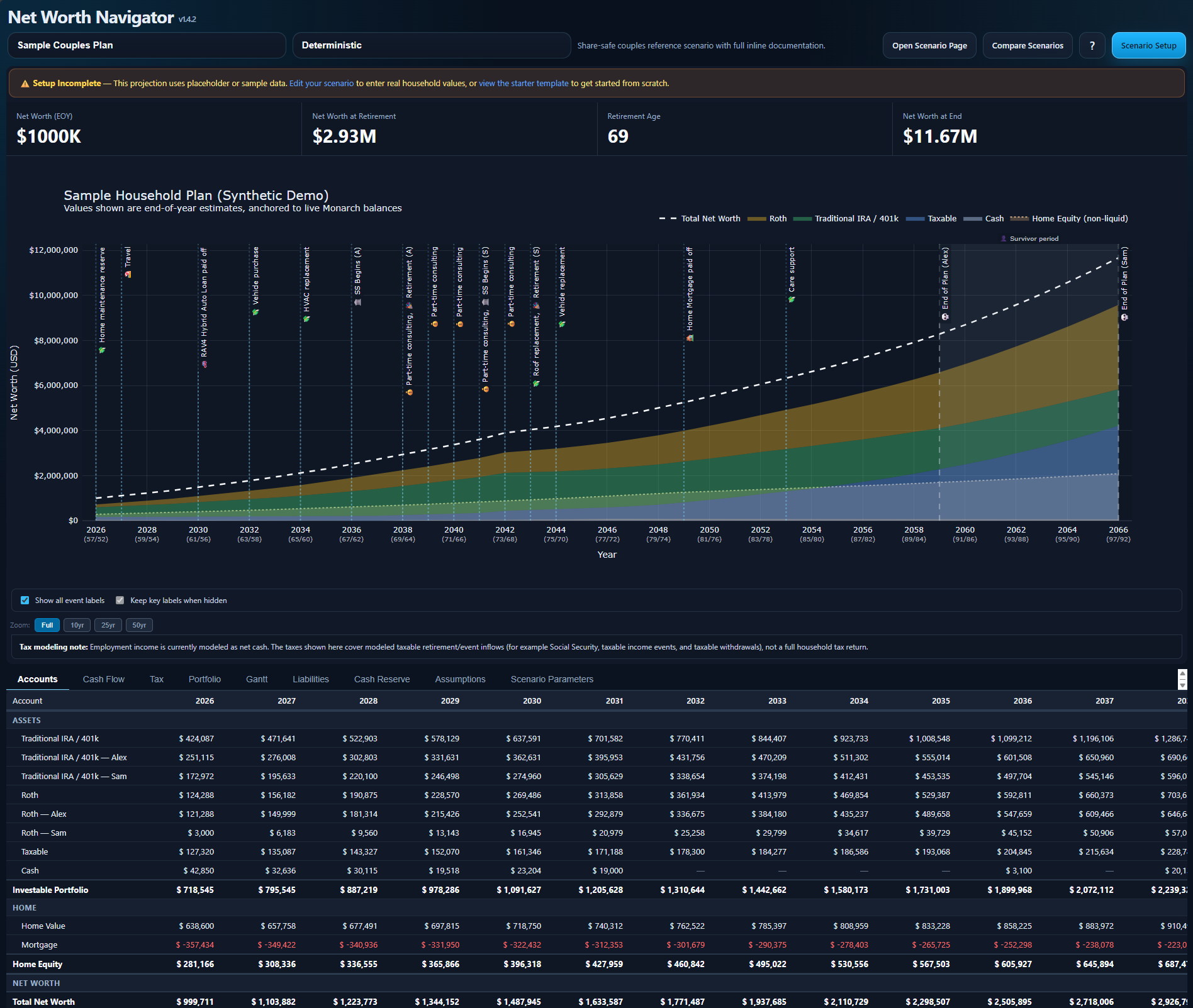
The KPI Strip
Section titled “The KPI Strip”Four key numbers are displayed at the top of every projection:
| KPI | What It Shows |
|---|---|
| Starting Net Worth | Your total net worth at the scenario’s start year |
| Net Worth at Retirement | Your projected net worth in the year the first person retires |
| Retirement Age | The age of the earliest-retiring person |
| Net Worth at End | Your projected net worth at the end of the projection period |
Tip: Enable Help Mode by clicking the ? button for plain-language explanations of each KPI.
The Main Chart
Section titled “The Main Chart”The main projection chart shows your net worth trajectory over time:
- Dashed white line (deterministic and historical mode) — a single trajectory using your fixed return assumptions
- Shaded bands (Monte Carlo mode) — probability ranges from the 10th to 90th percentile
- Solid white line (Monte Carlo mode) — the median (50th percentile) outcome
- Vertical event markers — labelled lines showing when key events occur (retirement, SS start, expenses, etc.)
- Age labels — shown below the year axis on wider screens
Chart Controls
Section titled “Chart Controls”| Control | What It Does |
|---|---|
| Zoom buttons (Full / 10yr / 25yr / 50yr) | Set the visible x-axis range |
| Scroll-wheel zoom | Zoom in/out on the x-axis |
| Double-click | Reset to full range |
| Event label toggles | Show/hide event annotation labels on the chart |
The Tabbed Panels
Section titled “The Tabbed Panels”Below the chart, ten tabbed panels provide detailed breakdowns:
| Tab | What It Shows |
|---|---|
| Accounts | Year-by-year balance breakdown per account type (cash, taxable, traditional IRA, Roth, home) with per-person ownership splits |
| Cash Flow | What happened to the money each year: income, spending, contributions, taxes, surplus routing by bucket |
| Tax | Federal and state tax breakdown per year, Social Security taxable fraction, cumulative totals and effective rates |
| Simulation | (Monte Carlo/Historical modes only) Outcome distributions, yearly results table, success/failure metrics |
| Portfolio | Investable assets only (taxable, traditional IRA, Roth) — separate from cash and home equity |
| Gantt | Timeline of all life events with milestone and span semantics, survivor-period band |
| Liabilities | Debt payoff trajectory chart and year-by-year amortization table for each loan |
| Cash Reserve | Cash balance vs phase-adjusted target, below-target highlight, per-phase summary card |
| Assumptions | Formatted summary of your scenario’s input parameters |
| Scenario Parameters | Full parameter listing with diff highlighting vs the default scenario. Use Show only differences to see what makes this scenario unique |
Year-Column Highlighting
Section titled “Year-Column Highlighting”Click any year header in the Accounts, Cash Flow, or Tax tables to highlight that column across all tables. This makes it easy to cross-reference the same year across different views. Double-click a highlighted year or press Escape to clear.
Data Point Semantics
Section titled “Data Point Semantics”Every data point on the chart and in the tables represents the end-of-year state — after that year’s income, spending, growth, and events have been applied. The chart subtitle says this explicitly.
Render Modes
Section titled “Render Modes”Each scenario can be viewed in up to three render modes — see Render Modes for details on deterministic, historical, and Monte Carlo projections.